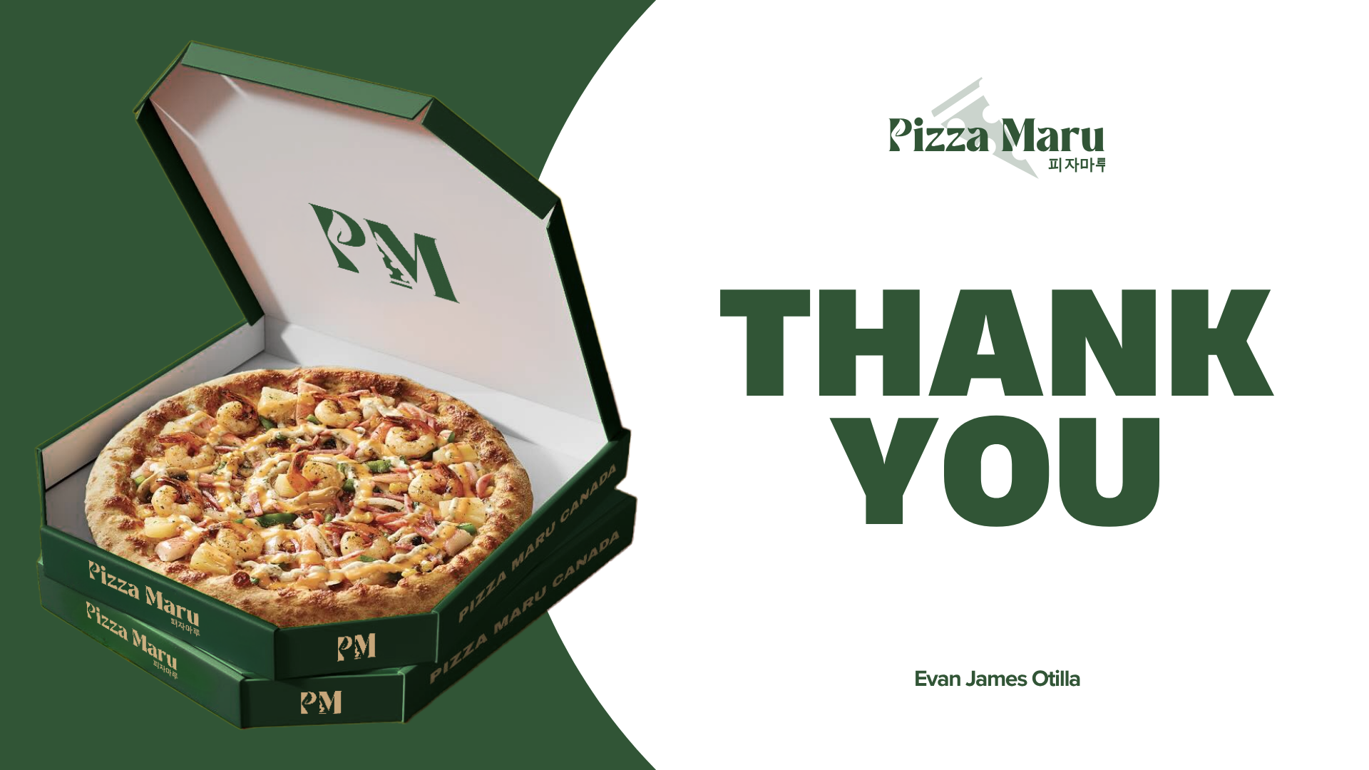
- Branding
- Case Study
This project was completed during my fourth semester at SAIT as a bonus assignment. We were tasked to choose a client and complete a redesign case study focusing on one or more components of the client’s business or brand.
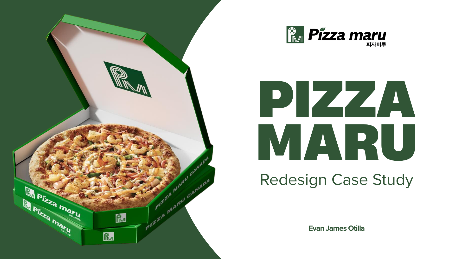
The goal was to identify problems within those components and propose plausible redesign solutions with proper justification. After researching businesses in Calgary that I felt needed a stronger brand identity, I chose Pizza Maru, a Korean pizza chain known for its unconventional toppings and crust styles, as the focus for this project.
Pizza Maru is a prominent Korean franchise chain with over 650 locations around the world, celebrated for patenting the world’s first “well-being pizza” made from organic green tea dough and natural grains. The name “Maru” actually means “the best” in Korean, which sets the tone for their focus on high-quality, innovative food.
They don’t explicitly label their target audience, but their brand positioning and social media presence clearly show that they target Gen Z and Millennials who want healthier, affordable Korean-fusion dining. Business-wise, they stick to an efficient, take-away-friendly franchise model that keeps operation costs low and prices realistic for customers. Instead of dumping money into traditional heavy advertising, they focus their energy on localization and continuous menu R&D to scale up globally.
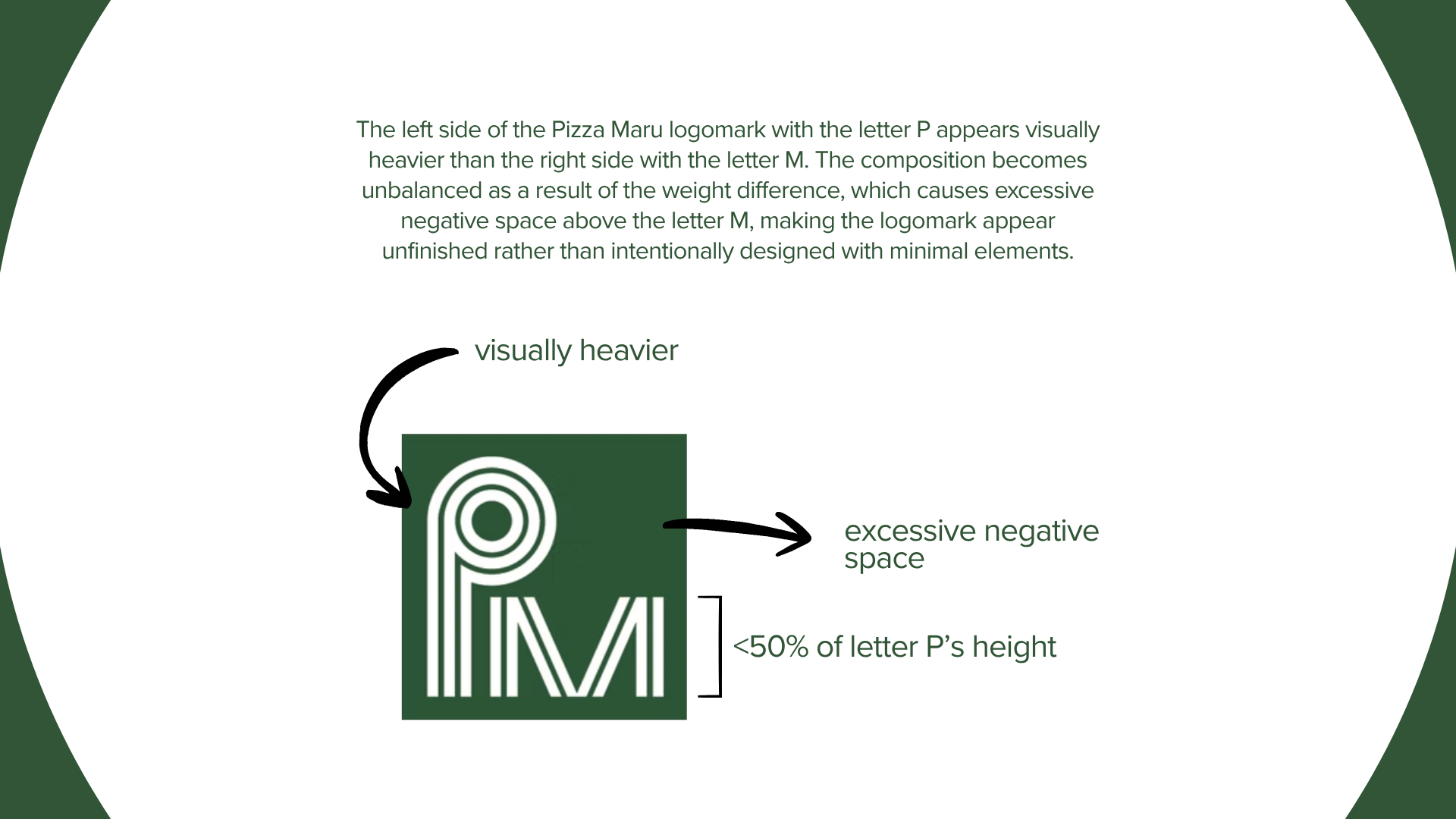
The logomark is unbalanced
The logomark feels too generic and abstract
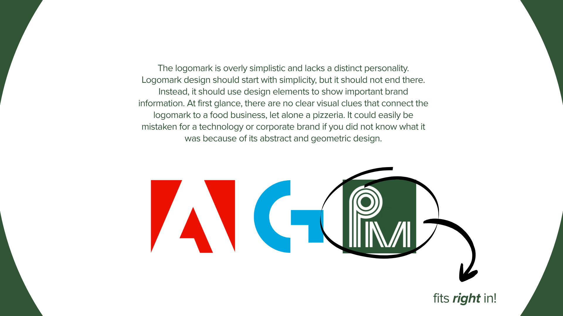
The logomark hides their selling points
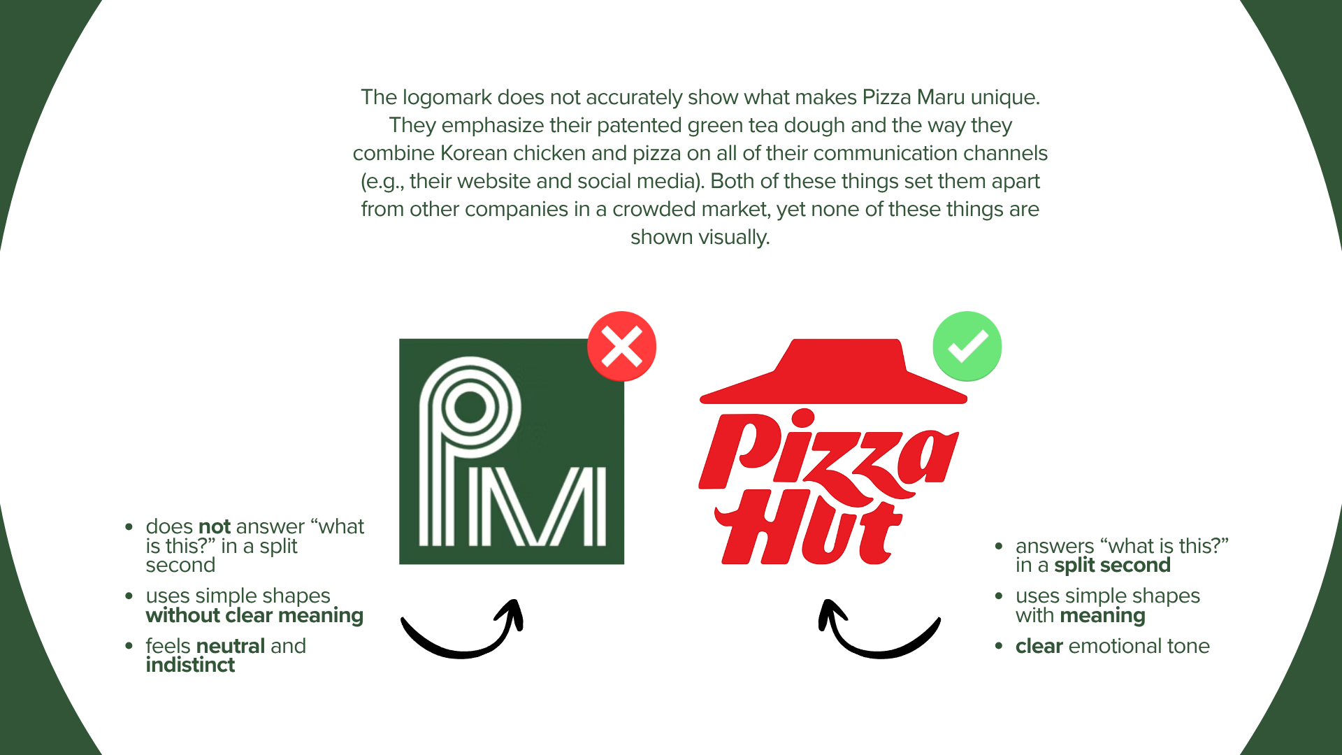
The logomark can’t decide on a single shade of green
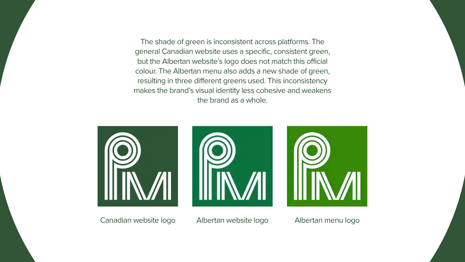
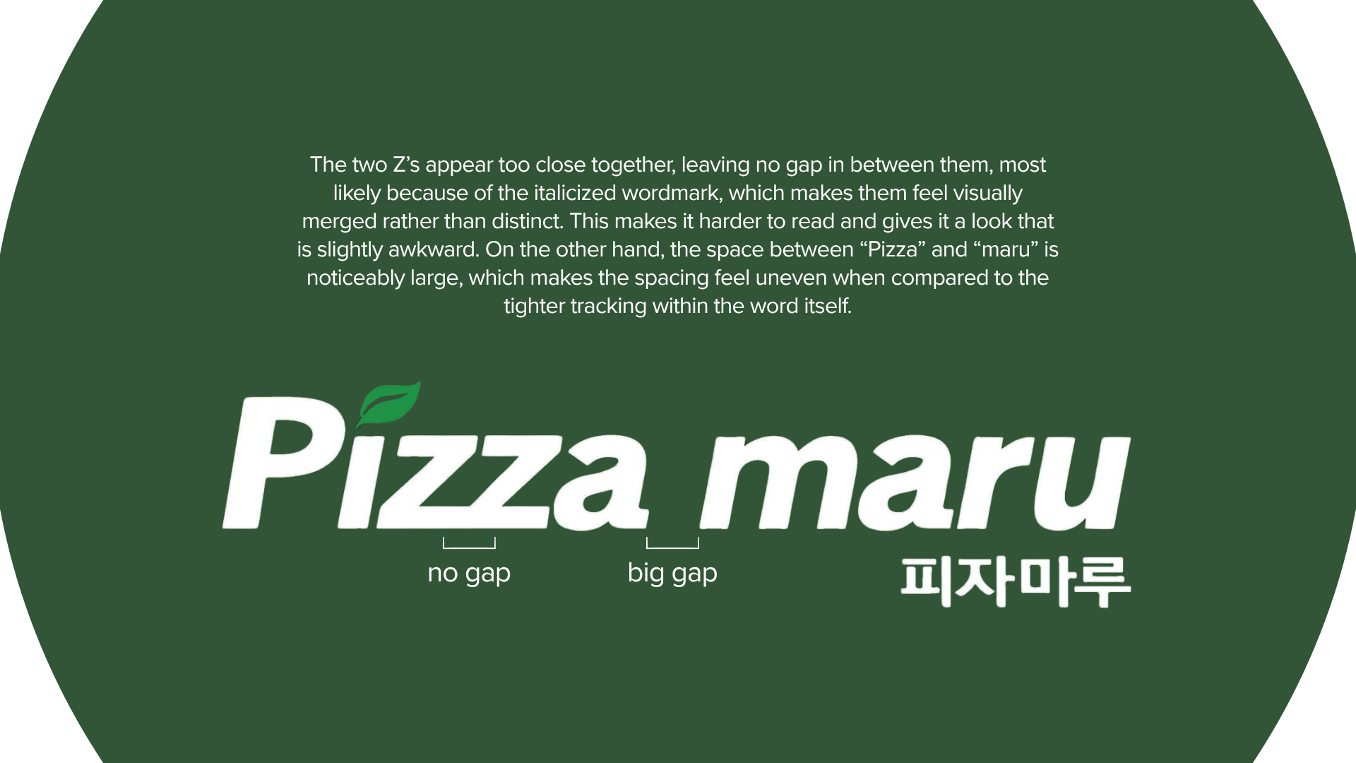
The wordmark spacing is awkward and uneven
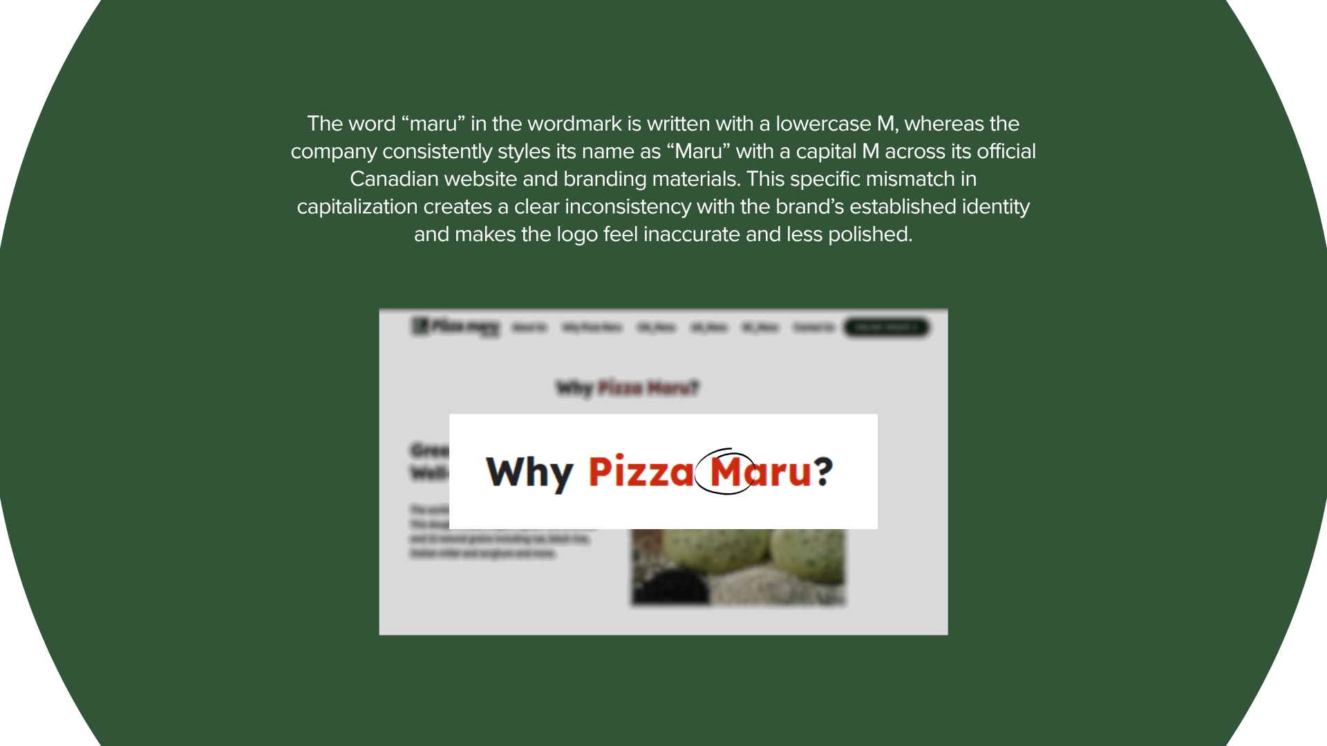
The wordmark's capitalization is inconsistent
All these issues leave the brand feeling totally disconnected from its unique story.
The brand would benefit from a new and improved brand identity that puts their green tea dough front and center, making it instantly obvious to customers what makes them special. Otherwise, they’re missing out on a massive opportunity to connect with and draw in more customers.
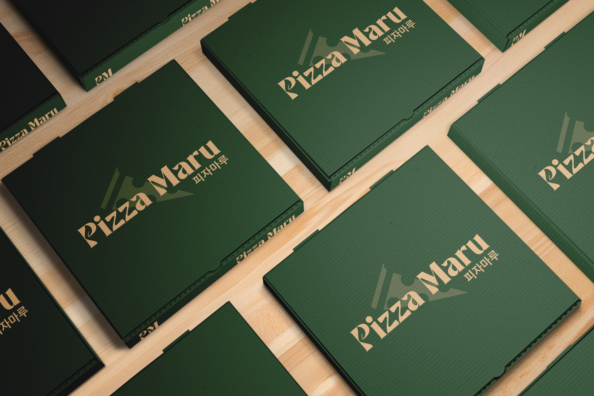
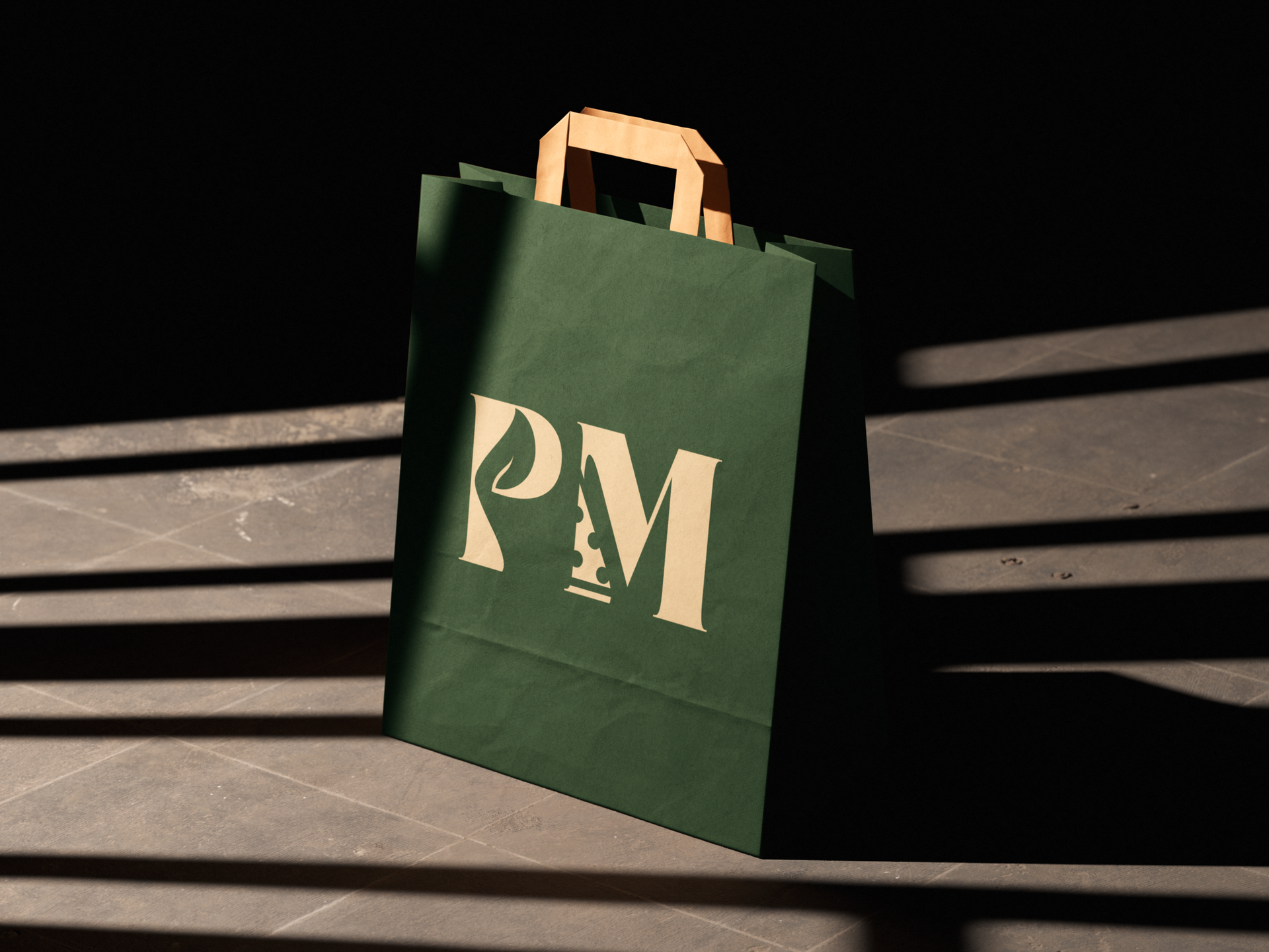
To fix the logomark’s balance and identity issues, I sketched a subtle pizza slice directly into the leg of the “M” and used that same shape at a low opacity behind the wordmark. I then tackled the messy typography by tightening up the awkward spacing, distinctively separating the “Z’s,” and correcting the capitalization of “Maru.” Finally, I unified the brand across all platforms by locking in one official dark green from their primary website and pairing it with a warm, dough-inspired beige.
Overall, fixing the typography and simplifying the shapes gives Pizza Maru the consistent identity it needs. The new visual system looks much more polished and high-end, finally doing justice to the brand's unique story.
Branding & Identity
Packaging Design
Poster Design
Editorial Design
Marketing & Advertising

Photo Manipulation

Project Details
- Client: Pizza Maru
- Author: Evan James Otilla
- Date: April 2026
- Type: Case Study
Categories
- Branding
- Case Study
Evan James Otilla